SKECHERS
Identity Design, Motion Design
14 Weeks
Personal Work
The rebrand infuses movement and energy into Skechers through clean visuals and dynamic motion, celebrating the spontaneity and joy of everyday life. By emphasizing lightness and fluidity, the new identity forges an emotional connection with consumers, positioning Skechers as a brand that empowers individuals to embrace the moment and rediscover the simple pleasure of being born to move.
CHALLENGE
Skechers’ long standing strength, comfort, has kept the brand resilient, but it has also limited its relevance in a market where younger consumers expect both comfort and performance. At the same time, the athletic footwear industry is experiencing a decline in performance shoe sales, forcing brands to rethink how they communicate value. Skechers needs to recapture a younger, more style driven audience without alienating the customers who made the brand successful.
The core challenge was to articulate a strategic shift, not just a visual refresh:
How can Skechers evolve from a comfort only brand into a brand that signals movement, energy, and contemporary lifestyle, while still leveraging its comfort heritage as a competitive advantage?
The core challenge was to articulate a strategic shift, not just a visual refresh:
How can Skechers evolve from a comfort only brand into a brand that signals movement, energy, and contemporary lifestyle, while still leveraging its comfort heritage as a competitive advantage?
APPROACH
My approach was grounded in redefining Skechers’ value for a new generation. Rather than treating comfort as the end point, I reframed it as the foundation for a more dynamic identity, one that speaks to young consumers who prioritize ease, spontaneity, and all day performance.
This meant designing a system that:
• connects comfort with motion, perspective, and fluidity
• introduces fashion aware visual language for younger buyers
• supports a strategic business goal: elevate Skechers into the comfort plus performance category
• maintains trust with the existing audience while expanding reach into a market seeking both utility and style
The design direction is not about decoration, it’s a response to an industry moment. It positions Skechers to stay competitive by bridging their strongest equity (comfort) with what the emerging audience now expects (performance, style, and energy).
SKECHERS
Identity Design, Motion Design
14 Weeks
Personal Work
This rebrand reframes Skechers from comfort only to comfort plus movement for a new generation. By introducing a system built around lightness, fluid motion, and perspective, the identity connects comfort with a sense of spontaneity and everyday energy.
CHALLENGE
Skechers’ long standing strength, comfort, has kept the brand resilient, but it has also limited its relevance in a market where younger consumers expect both comfort and performance. At the same time, the athletic footwear industry is experiencing a decline in performance shoe sales, forcing brands to rethink how they communicate value. Skechers needs to recapture a younger, more style driven audience without alienating the customers who made the brand successful.
The core challenge was to articulate a strategic shift, not just a visual refresh:
How can Skechers evolve from a comfort only brand into a brand that signals movement, energy, and contemporary lifestyle, while still leveraging its comfort heritage as a competitive advantage?
The core challenge was to articulate a strategic shift, not just a visual refresh:
How can Skechers evolve from a comfort only brand into a brand that signals movement, energy, and contemporary lifestyle, while still leveraging its comfort heritage as a competitive advantage?
APPROACH
My approach was grounded in redefining Skechers’ value for a new generation. Rather than treating comfort as the end point, I reframed it as the foundation for a more dynamic identity, one that speaks to young consumers who prioritize ease, spontaneity, and all day performance.
This meant designing a system that:
• connects comfort with motion, perspective, and fluidity
• introduces fashion aware visual language for younger buyers
• supports a strategic business goal: elevate Skechers into the comfort plus performance category
• maintains trust with the existing audience while expanding reach into a market seeking both utility and style
The design direction is not about decoration, it’s a response to an industry moment. It positions Skechers to stay competitive by bridging their strongest equity (comfort) with what the emerging audience now expects (performance, style, and energy).
This meant designing a system that:
• connects comfort with motion, perspective, and fluidity
• introduces fashion aware visual language for younger buyers
• supports a strategic business goal: elevate Skechers into the comfort plus performance category
• maintains trust with the existing audience while expanding reach into a market seeking both utility and style
The design direction is not about decoration, it’s a response to an industry moment. It positions Skechers to stay competitive by bridging their strongest equity (comfort) with what the emerging audience now expects (performance, style, and energy).
RECOGNITION
Featured in World Brand Design
🏆Muse Creative Awards 2025 (Motion Graphics), Gold
🏆Viddy Awards 2025 (Rebrand Motion Montage), Platinum Winner
🏆Hermes Creative Awards 2025 (Motion Graphics), Platinum Winner
🏆Paris Design Awards 2025 (Graphic Design), Winner
🏆Graphis New Talent Awards 2025 (Motion Graphics), Gold
🏆Indigo Design Award 2025 (Mix Media), Gold
🏆Indigo Design Award 2025 (Computer Animation), Gold
🥈Indigo Design Award 2025 (Branding), Silver
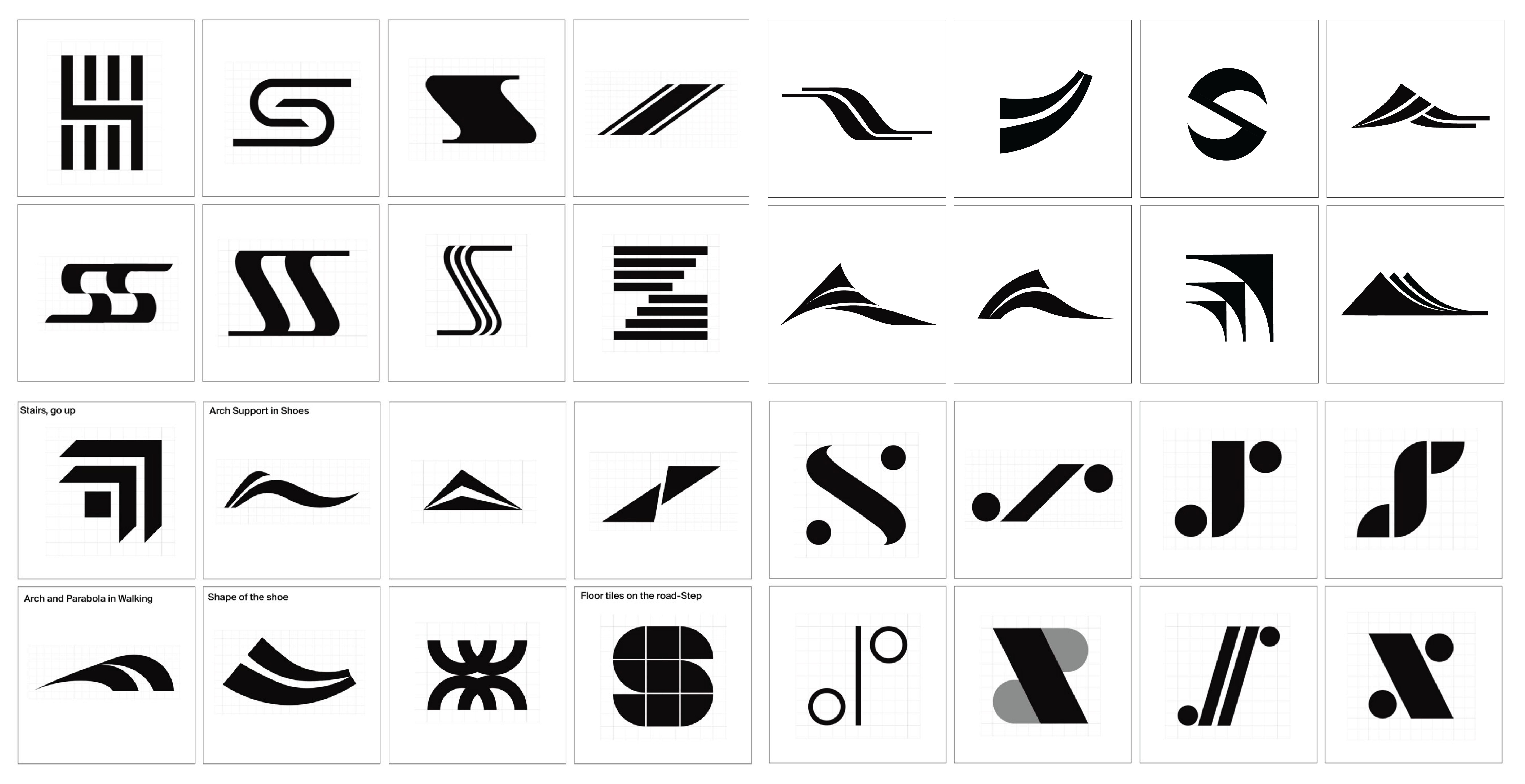
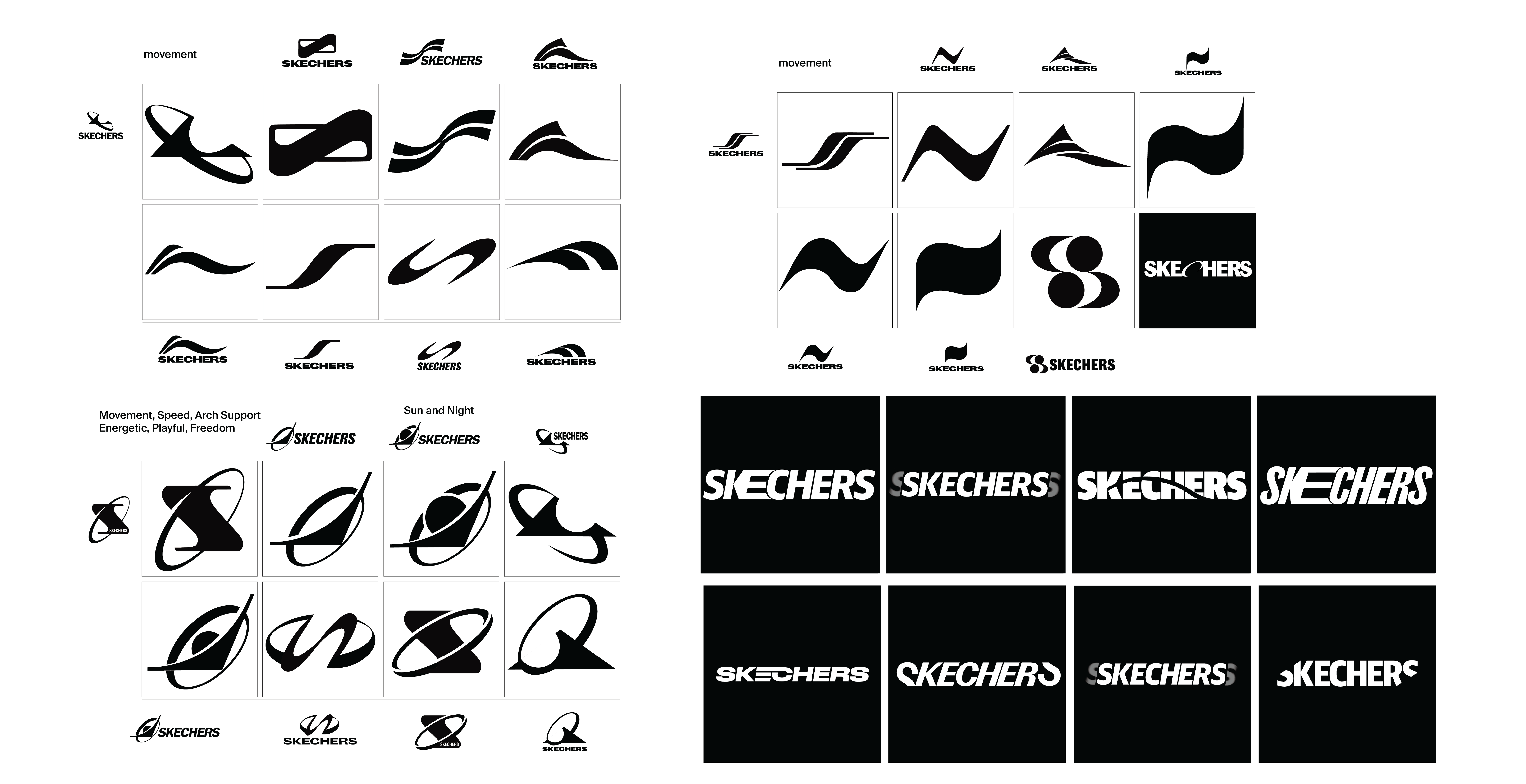
Logo Development


Notes:
The logo draws inspiration from a 3.5 cm arch support, symbolizing Skechers’ focus on comfort and movement. Its bold, dynamic lines reflect energy and effortless comfort.
The logo draws inspiration from a 3.5 cm arch support, symbolizing Skechers’ focus on comfort and movement. Its bold, dynamic lines reflect energy and effortless comfort.
Tagline

Brand Voice:
Skechers’ brand voice is warm, approachable, and uplifting, grounded in simplicity and joy. It builds trust and encourages a carefree, confident way of moving through life.
Skechers’ brand voice is warm, approachable, and uplifting, grounded in simplicity and joy. It builds trust and encourages a carefree, confident way of moving through life.
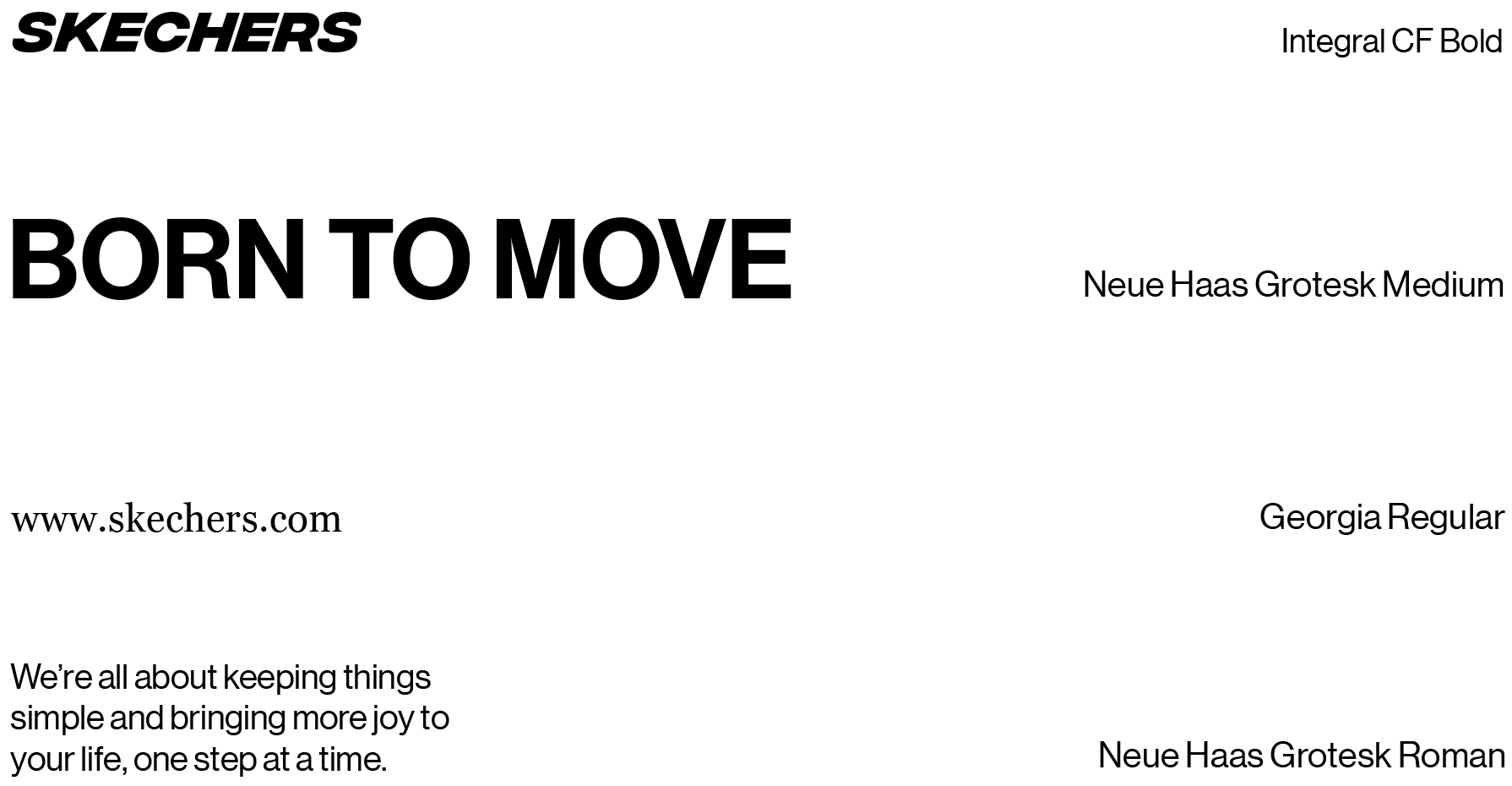
Typography
Graphic System
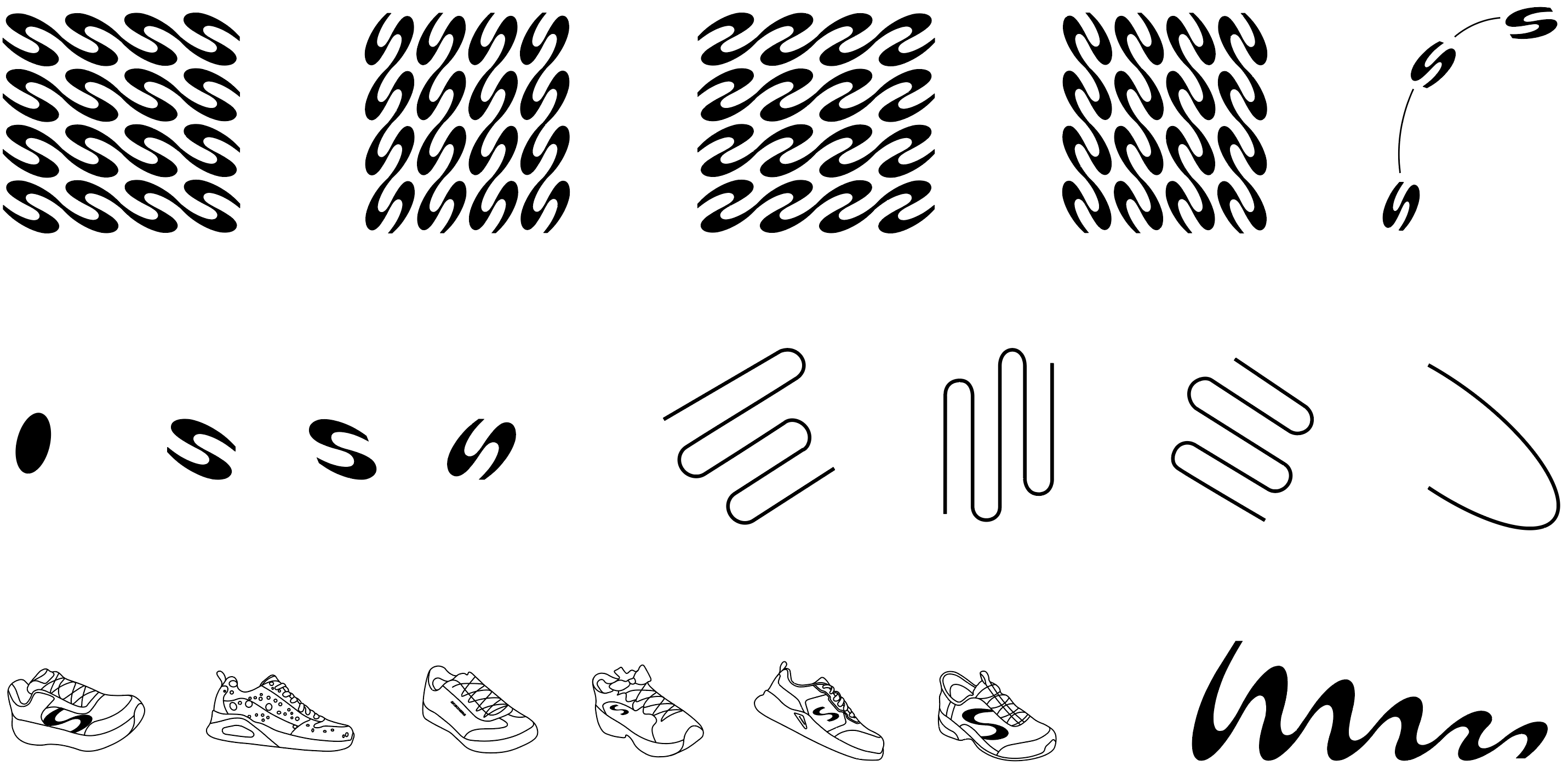


Notes:
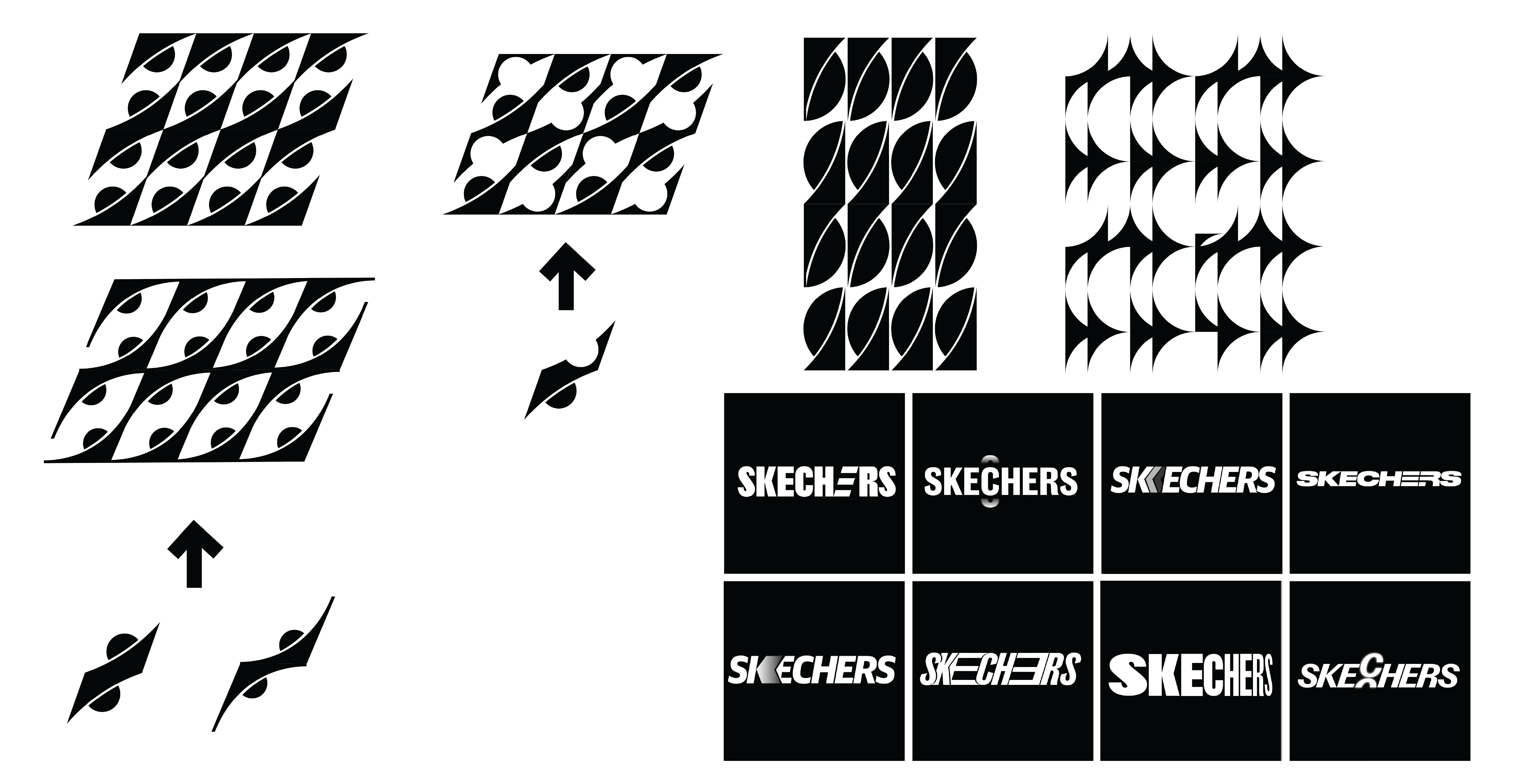
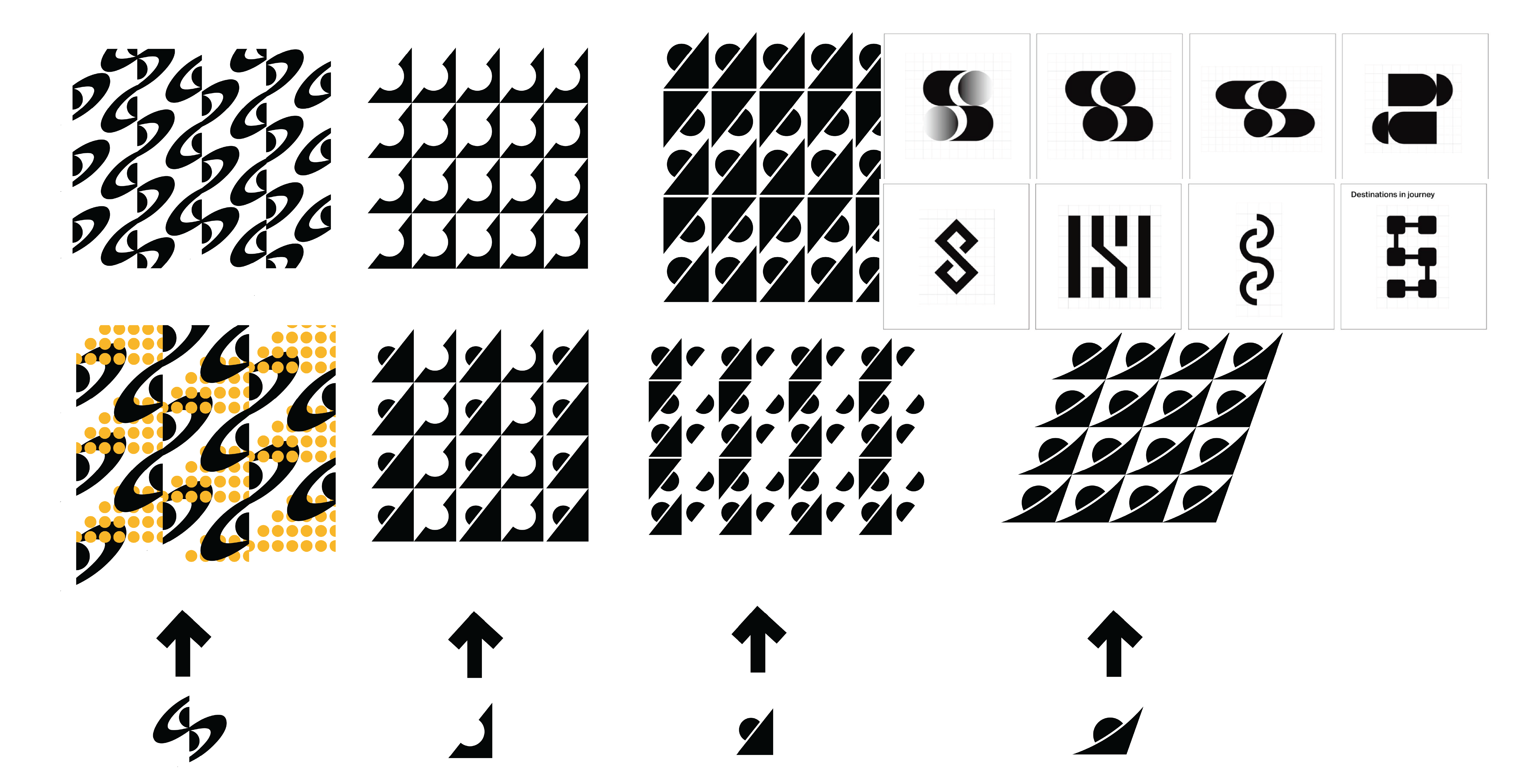
The graphic system grows from the logo’s rhythm, repeated lines and fluid patterns express continuous movement, while subtle shoe forms ground the energy in Skechers’ product story.
The graphic system grows from the logo’s rhythm, repeated lines and fluid patterns express continuous movement, while subtle shoe forms ground the energy in Skechers’ product story.
Color Palette


Notes:
The color palette captures Skechers’ spirit of movement: turquoise for calm balance, purple for confidence, and orange for the joy and spontaneity of everyday life.
The color palette captures Skechers’ spirit of movement: turquoise for calm balance, purple for confidence, and orange for the joy and spontaneity of everyday life.
Transition


Notes:
Transitions are built on rhythm and flow, match cuts keep the rhythm alive, while motion itself becomes a guide, revealing one moment through the next.
Transitions are built on rhythm and flow, match cuts keep the rhythm alive, while motion itself becomes a guide, revealing one moment through the next.
Environmental Mockup
.png)
Notes:
Each colorway is placed to match the emotional tone of its environment. The orange variation sits along commuter routes and neighborhood streets, using warmth and energy to mirror the rhythm of everyday life and reinforce Skechers’ connection to comfort driven activity.
Each colorway is placed to match the emotional tone of its environment. The orange variation sits along commuter routes and neighborhood streets, using warmth and energy to mirror the rhythm of everyday life and reinforce Skechers’ connection to comfort driven activity.


Notes:
These mockups show the campaign in real urban settings, placed in high traffic areas where young, style driven consumers are most present. At large scale, the visuals create a strong sense of motion and perspective, making the brand feel energetic and impossible to miss.
These mockups show the campaign in real urban settings, placed in high traffic areas where young, style driven consumers are most present. At large scale, the visuals create a strong sense of motion and perspective, making the brand feel energetic and impossible to miss.
Notes:
The purple set lives in dense city corridors, speaking to younger, style driven consumers with a cool, modern tone that supports Skechers’ shift toward a more contemporary, performance leaning identity.
The purple set lives in dense city corridors, speaking to younger, style driven consumers with a cool, modern tone that supports Skechers’ shift toward a more contemporary, performance leaning identity.
.png)
Notes:
The cyan set appears near parks and open walkways, reflecting a lifestyle that blends comfort with ease. Its light, spontaneous feel resonates with consumers who prefer intuitive, unforced movement.
The cyan set appears near parks and open walkways, reflecting a lifestyle that blends comfort with ease. Its light, spontaneous feel resonates with consumers who prefer intuitive, unforced movement.
.png)
.png)
Identitiy Poster


Notes:
These photography shot with extreme angles, the imagery creates a sense of spontaneity and foreshortened motion, as if the viewer stumbled into a moment already in motion. The layered compositions and dynamic cropping amplify energy while keeping the emotional tone playful, intimate, and human.
These photography shot with extreme angles, the imagery creates a sense of spontaneity and foreshortened motion, as if the viewer stumbled into a moment already in motion. The layered compositions and dynamic cropping amplify energy while keeping the emotional tone playful, intimate, and human.


Notes:
This set explores movement from a bird’s-eye perspective, using Skechers’ pattern as an active environment. The pattern becomes a flowing ground plane, creating dynamic contrast between motion (the figures) and structure (the pattern). The shifting shadows and varying stride directions introduce rhythm and density.
This set explores movement from a bird’s-eye perspective, using Skechers’ pattern as an active environment. The pattern becomes a flowing ground plane, creating dynamic contrast between motion (the figures) and structure (the pattern). The shifting shadows and varying stride directions introduce rhythm and density.


Notes:
In this series, motion is visualized through layered arcs and traced paths, turning each figure into a living expression of speed and style. The lines emphasize body extension, weight shift, and directionality, creating a continuous sense of flow. The perspective choices, mid action jumps, twists, and stretches, evoke freedom and athletic spontaneity.
In this series, motion is visualized through layered arcs and traced paths, turning each figure into a living expression of speed and style. The lines emphasize body extension, weight shift, and directionality, creating a continuous sense of flow. The perspective choices, mid action jumps, twists, and stretches, evoke freedom and athletic spontaneity.


Notes:
The composition uses irregular spacing, and unexpected placements to create a modern, energetic visual vernacular. By letting the letters behave like moving elements, expanding, drifting, bumping, the posters reflect a younger audience’s preference for bold, contemporary expression.
The composition uses irregular spacing, and unexpected placements to create a modern, energetic visual vernacular. By letting the letters behave like moving elements, expanding, drifting, bumping, the posters reflect a younger audience’s preference for bold, contemporary expression.
Content Poster


Website
Notes:
This website translates the new identity into a lightweight, intuitive digital experience. Designed for a younger audience that values ease, it uses minimal layouts and playful interactions to support accessibility and reduce visual noise. The experience highlights motion, perspective, and spontaneity, reinforcing comfort while introducing a modern, responsive environment that matches how today’s consumers engage with lifestyle brands.
This website translates the new identity into a lightweight, intuitive digital experience. Designed for a younger audience that values ease, it uses minimal layouts and playful interactions to support accessibility and reduce visual noise. The experience highlights motion, perspective, and spontaneity, reinforcing comfort while introducing a modern, responsive environment that matches how today’s consumers engage with lifestyle brands.
Mobile


Process
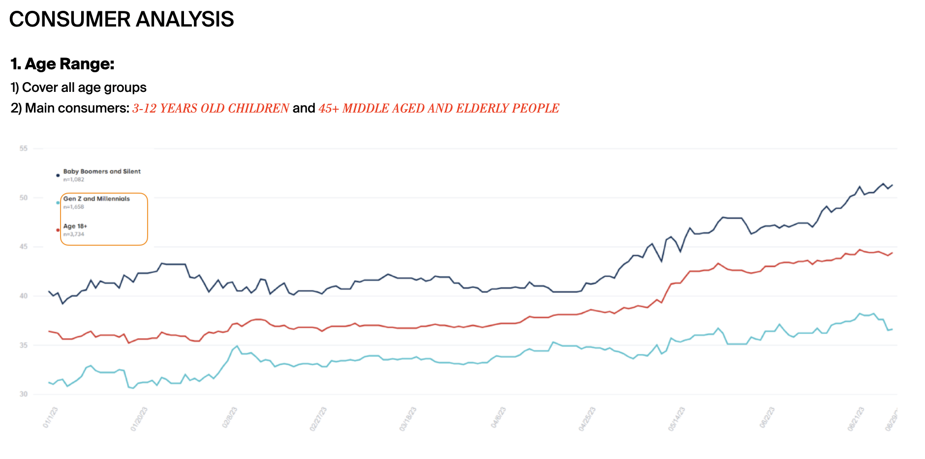
1) Brand Strategy



2) Brand elements

Software: After Effects, Photoshop, InDesign, Illustrator
Background Music: Put The Work In
Photography, Footage: Dave Hill
Background Music: Put The Work In
Photography, Footage: Dave Hill
* The images and videos only use for educational and non commercial use.

