CHICAGO CUBS
Social Media Design, Brand Strategy
1.5 months
Client Pitch Work
Client: Chicago Cubs
Agency: Energy BBDO
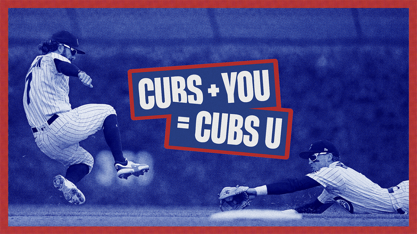
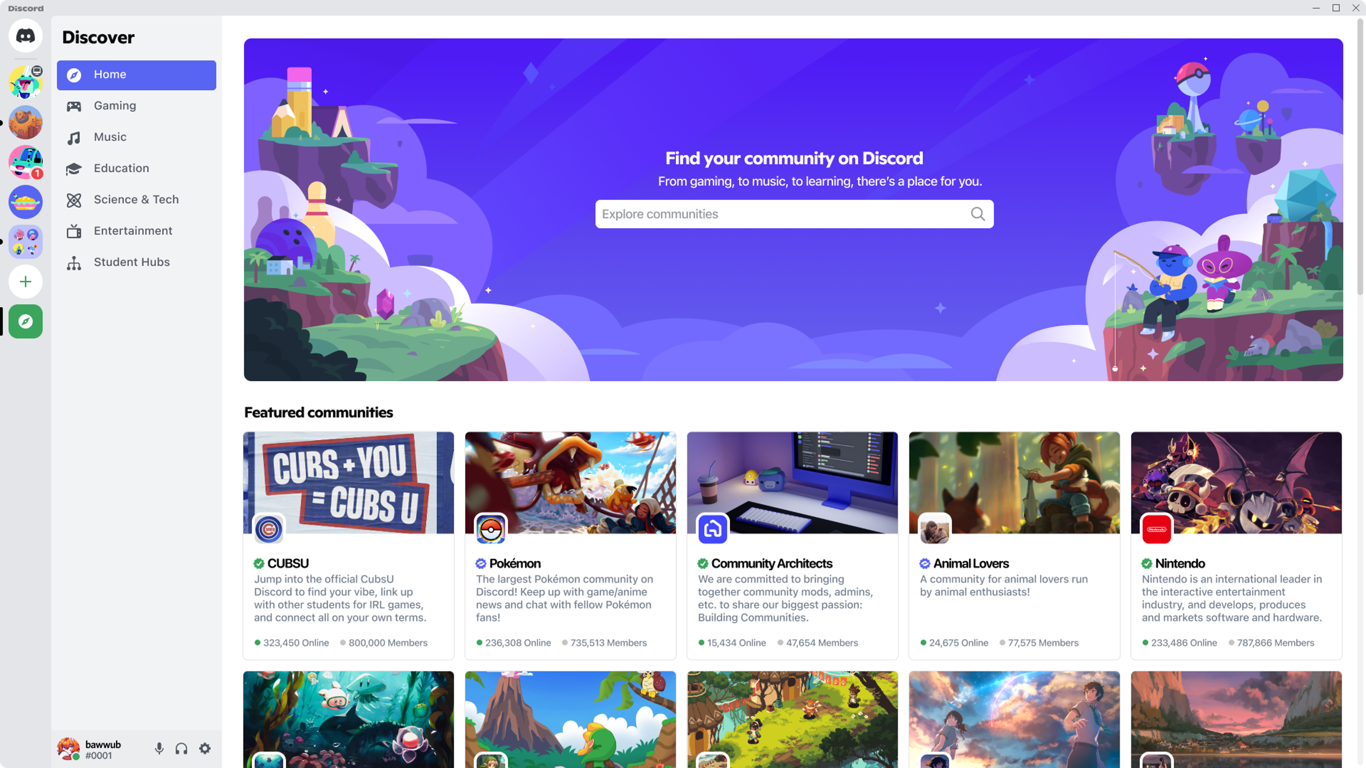
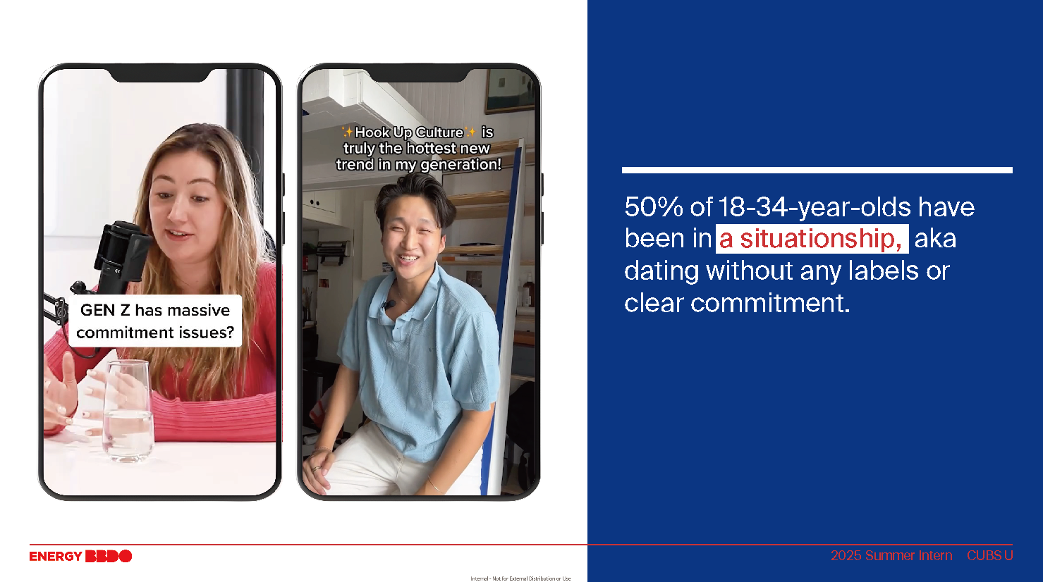
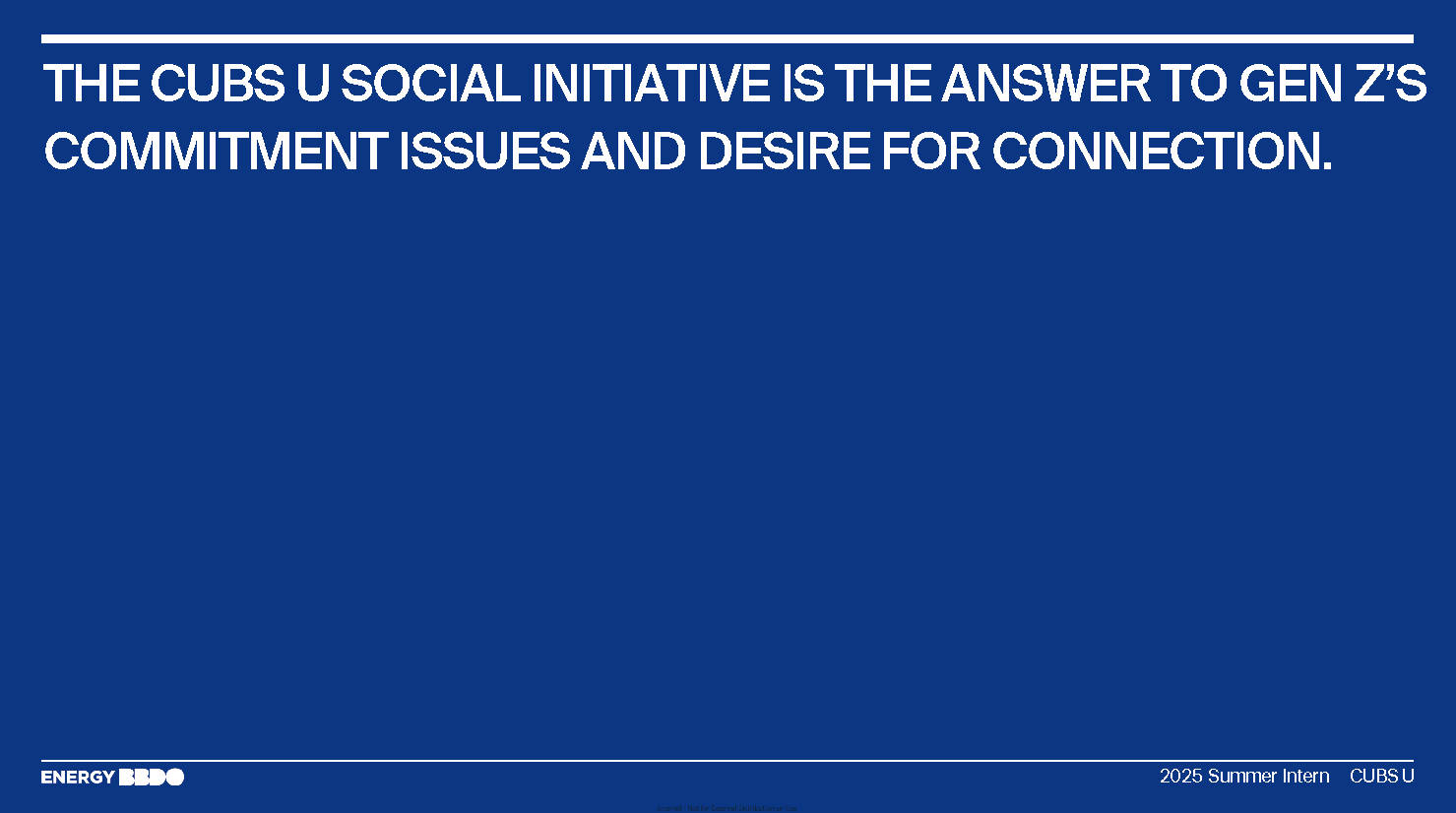
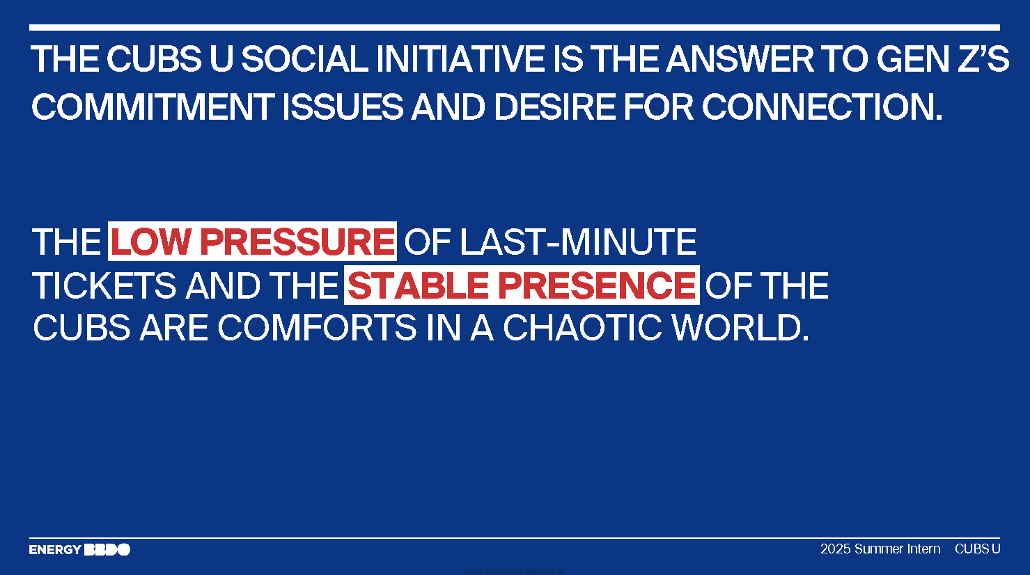
We created a campaign and visual identity for Cubs U that reframes going to Wrigley Field as a casual, low pressure hang. Gen Z students aren’t looking for baseball, they’re looking for vibes. So we positioned Cubs U as a “situationship” with the Cubs: playful, chill, and commitment free. From cheeky tone to social first activations like Discord hangouts and “Baseball & Chill” pop ups, the brand invites students to show up, not suit up.
CHALLENGE
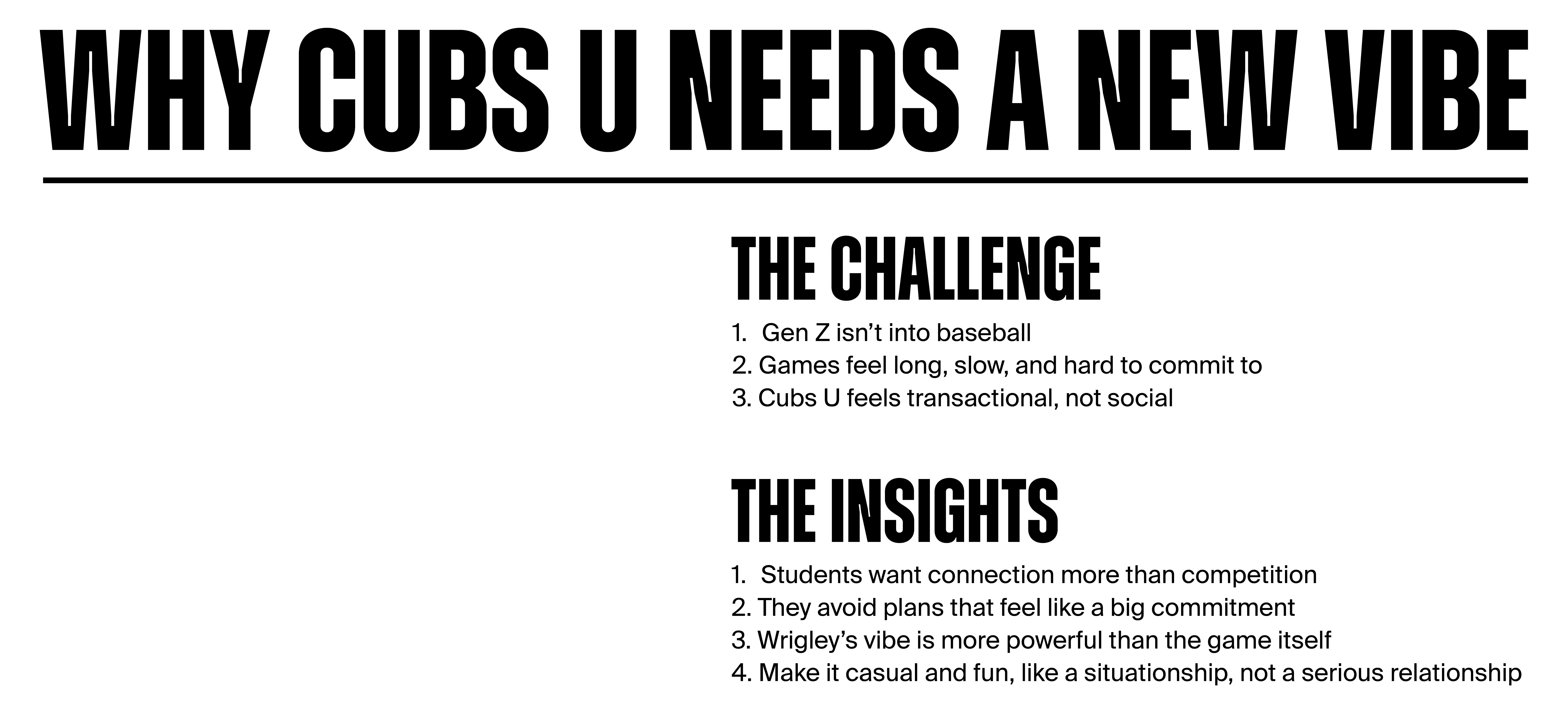
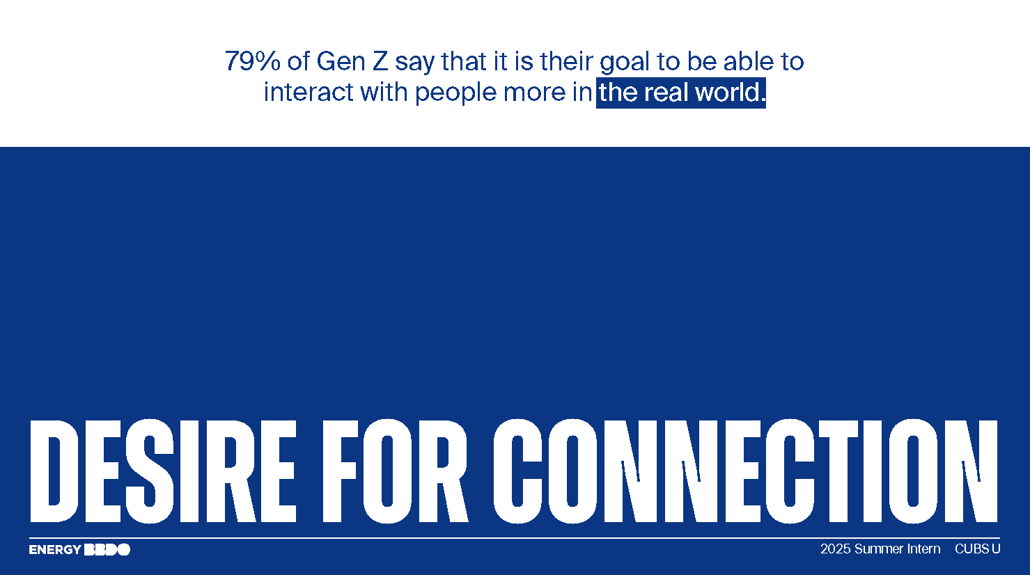
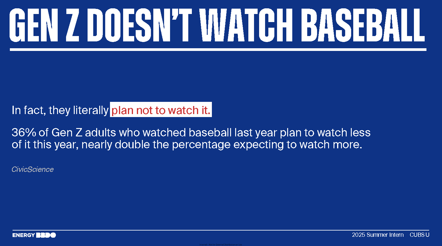
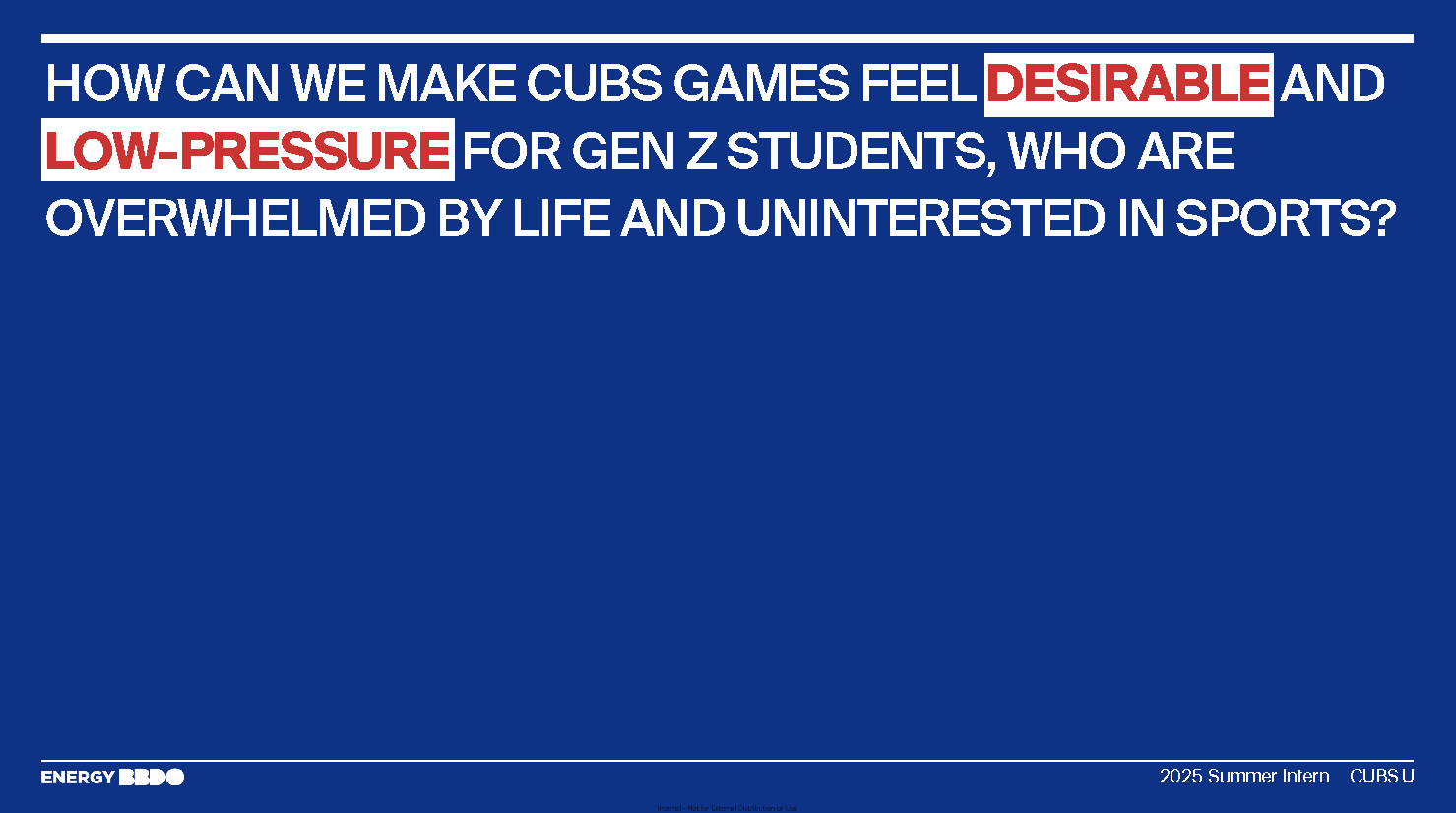
The challenge was understanding why baseball fails to resonate with students in the first place. Gen Z’s relationship with sports is fragmented: they care less about the game itself and more about expression, identity, and shareable cultural moments. Traditional team messaging feels static to them, which puts the Cubs at a disadvantage on campus.
Our challenge was to translate the Cubs’ heritage into a format that behaves the way Gen Z communicates, fast, emotional, and socially native, and to build an idea that could organically live inside their day to day digital language.
Our challenge was to translate the Cubs’ heritage into a format that behaves the way Gen Z communicates, fast, emotional, and socially native, and to build an idea that could organically live inside their day to day digital language.
APPROACH
During ideation, the team push concepts that felt expressive, playful, and culturally fluent.
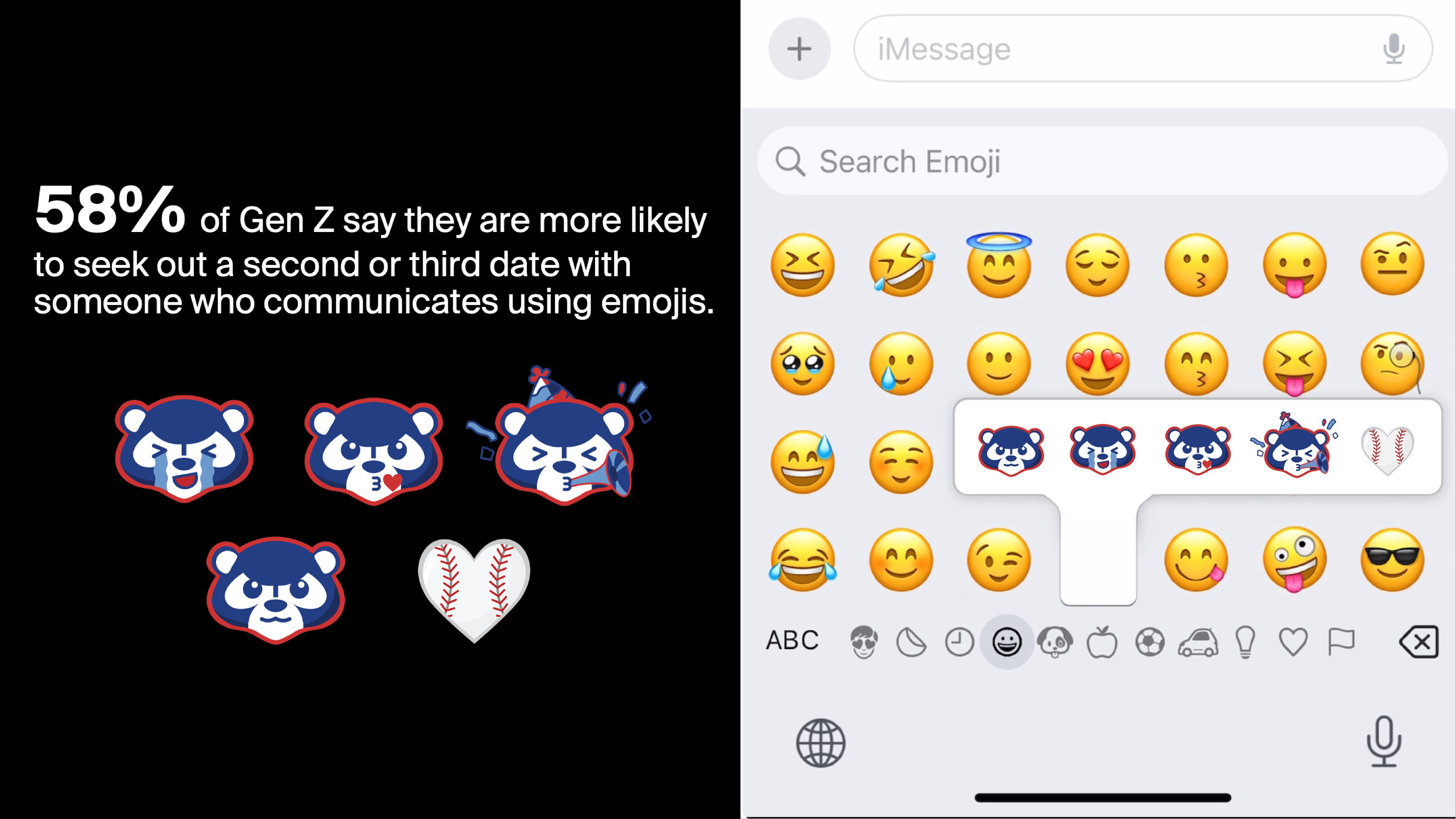
One of my key contributions was proposing a Cubs emoji system designed specifically for how Gen Z shares mood, humor, and identity online. The idea lets the Cubs participate in the way students already communicate. I collaborated closely with strategists to ground the concept in audience insight, then translated those insights into a complete, campaign ready visual asset built for virality, interaction, and social spread.
One of my key contributions was proposing a Cubs emoji system designed specifically for how Gen Z shares mood, humor, and identity online. The idea lets the Cubs participate in the way students already communicate. I collaborated closely with strategists to ground the concept in audience insight, then translated those insights into a complete, campaign ready visual asset built for virality, interaction, and social spread.
Challenge & Insights
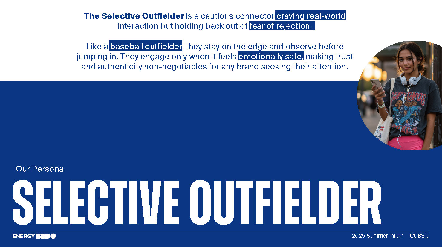
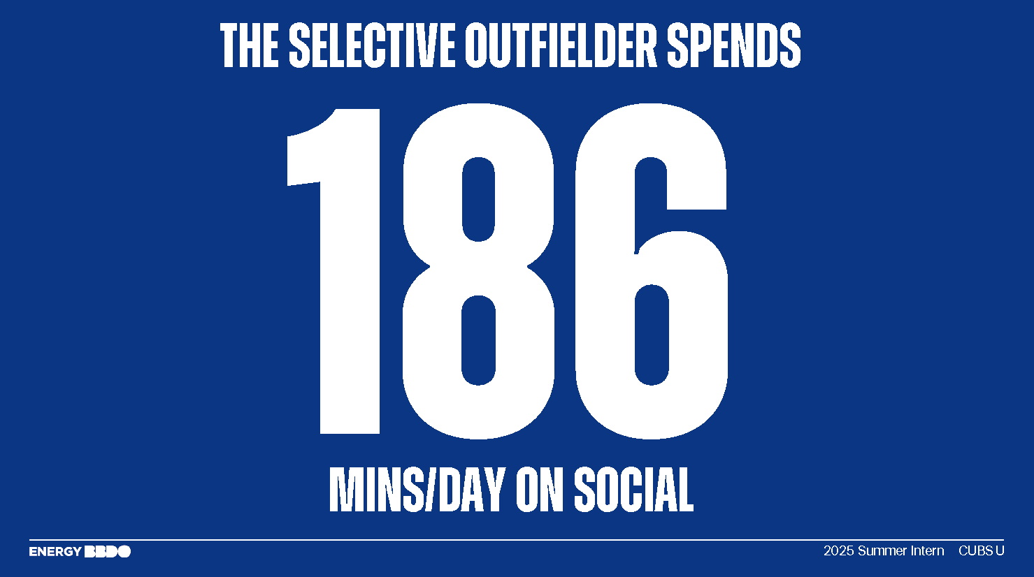
Persona

Big Idea

Key Visuals
Notes:
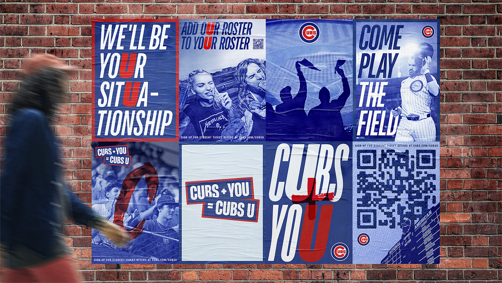
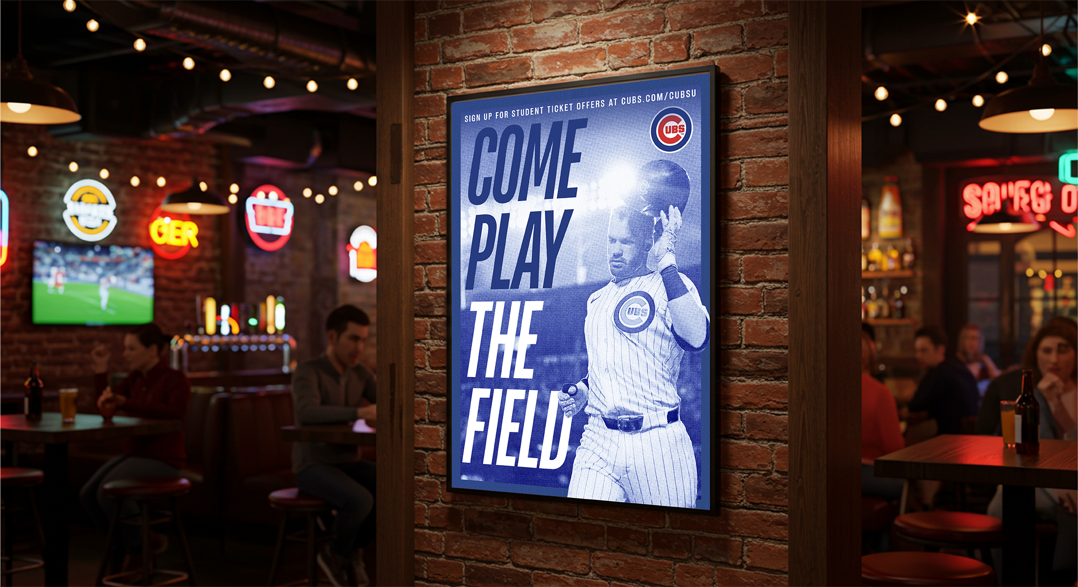
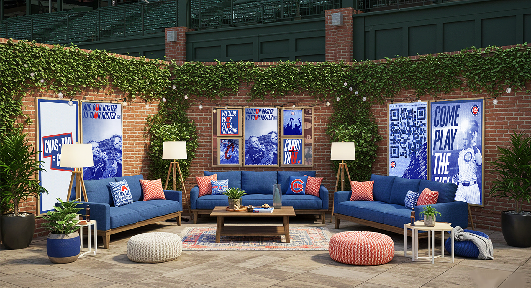
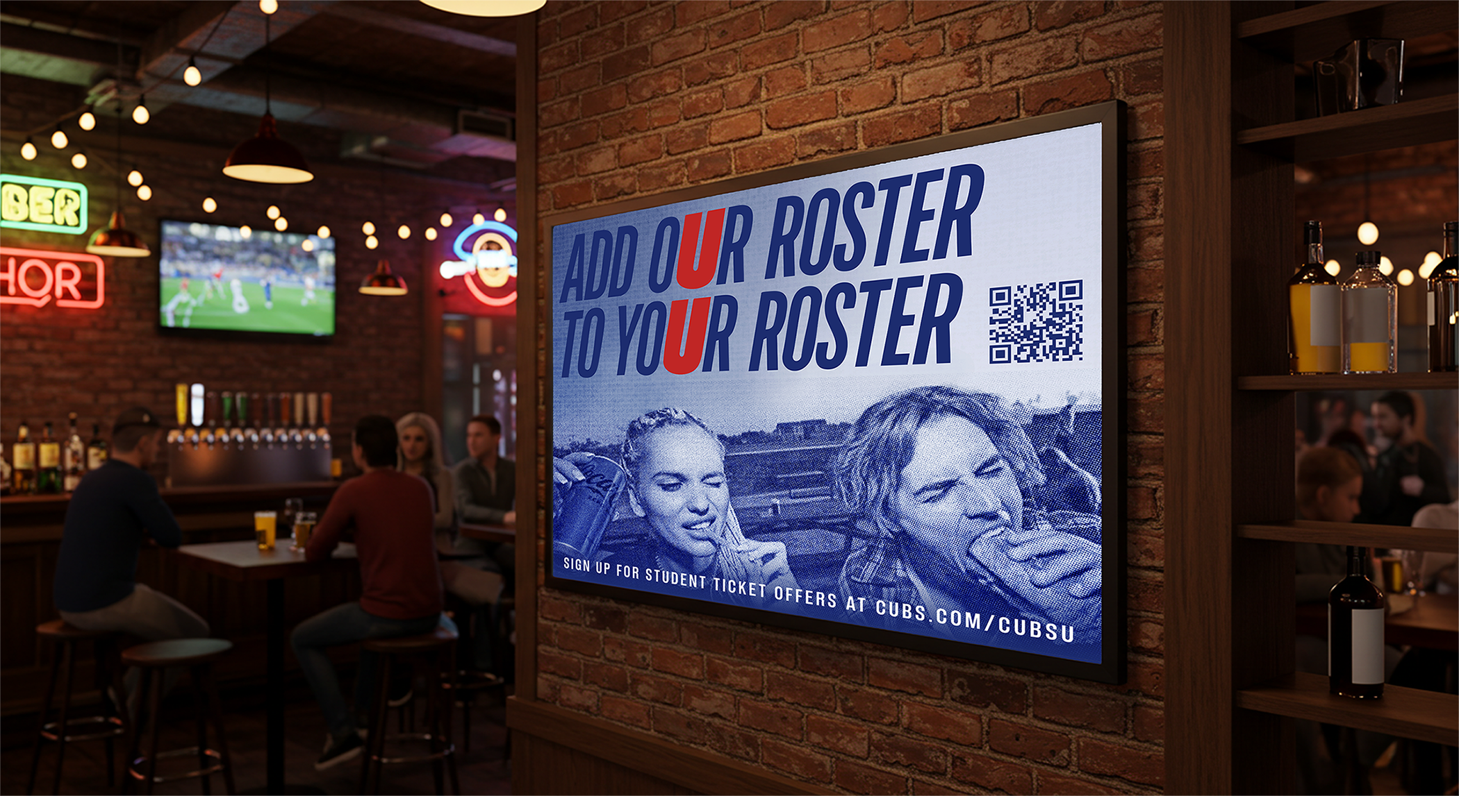
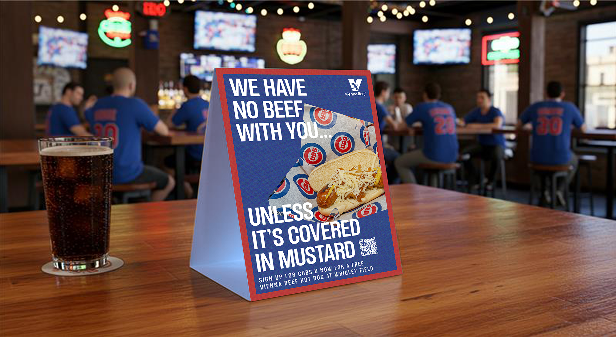
These posters were created for campus bars and the Cubs U social zone at Wrigley, places where students naturally gather with zero pressure. The bold typography, punchy headlines, and gritty textures mirror the fast, high energy atmosphere of these spaces, making the work feel native to student culture. By meeting students where they already hang out, the visuals make the Cubs feel fun, approachable, and woven into their everyday social life.
These posters were created for campus bars and the Cubs U social zone at Wrigley, places where students naturally gather with zero pressure. The bold typography, punchy headlines, and gritty textures mirror the fast, high energy atmosphere of these spaces, making the work feel native to student culture. By meeting students where they already hang out, the visuals make the Cubs feel fun, approachable, and woven into their everyday social life.
Social Media Emojis
Notes:
I created a set of five custom emojis helped the Chicago Cubs stand out in a market where every team fights for Gen Z attention. Each emoji turns the Cubs into something shareable, reactive, and social first. This expands the brand’s daily visibility, increases organic reach, and positions the Cubs as the team that understands student culture better than its competitors. By transforming emotions into branded expressions, the emojis become a low cost, high impact driver for social engagement, campus relevance, and long term affinity.
I created a set of five custom emojis helped the Chicago Cubs stand out in a market where every team fights for Gen Z attention. Each emoji turns the Cubs into something shareable, reactive, and social first. This expands the brand’s daily visibility, increases organic reach, and positions the Cubs as the team that understands student culture better than its competitors. By transforming emotions into branded expressions, the emojis become a low cost, high impact driver for social engagement, campus relevance, and long term affinity.
Social Media Content

Notes:
Cubs U will create a dating profile on Tinder that students can actually match and message with. Photos play on silly dating app tropes with a CTA to sign up.
Cubs U will create a dating profile on Tinder that students can actually match and message with. Photos play on silly dating app tropes with a CTA to sign up.
Presentation Design & Brand Strategy









Design: Eleanor Yang
Art Direction: Natalie Bazydlo
Copywrite: Kelly Combs
Strategy: Adam Goodreau, Alva Nguyen
Account: Helena Murphy
Agency: Energy BBDO
Special thanks: Jenna Nussbaum, Chelsea Henricks, Jennifer Layton
Software: After Effects, Figma, Photoshop, InDesign, Illustrator, PowerPoint
AI Tools: Image FX (Image generate)

